

California has been much cooler this summer. Most of us have felt it. Haven’t we?
There have been several headlines on this topic, but I haven’t been fully satisfied with the explanations provided so far. A general consensus is that it is mainly caused by a high pressure system that has persisted over the northeastern Pacific since May, which is pushing cool winds toward California. While this is a plausible immediate explanation, there is much more to this story because ultimately it is the sea surface temperature of the eastern Pacific that drives California’s weather across different time scales. But for now, I just wanted to look at the historical temperature for a better context.
I have plotted the average daily maximum temperature at San Diego International Airport for July since 1998. Below are my takes from the graph:

Average daily maximum temperature in July at San Diego International Airport (1998-2025).
1. Our experience is relative. Last summer was relatively hot so we are perceiving this year as a cooler year in comparison. The year 2022 was also cool, like this year, but we’ve already forgotten that experience.
2. The years 2006 and 2018 stand out as the hottest years, in which the temperatures were well above 6°F than this year. We must not forget these hottest years because they will for sure return. The heatwaves of 2006 killed more than 600 people in a single month (July) in California. These numbers are highly underestimated because deaths and illnesses due to heat are not properly accounted for, for various reasons, in the US.
3. It appears that the coolest year was 2010, in which the average temperature was about 3°F cooler than this year.
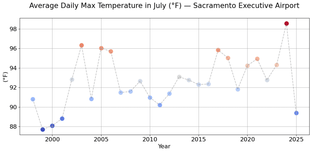
Wonder how it looks in the Northern California? I have the plot for Sacramento as well below. Northern California looks the coolest in the last 20 years this year.
Is there anything else worth noting in the graphs? As a Californian, which of these years do you remember and why?