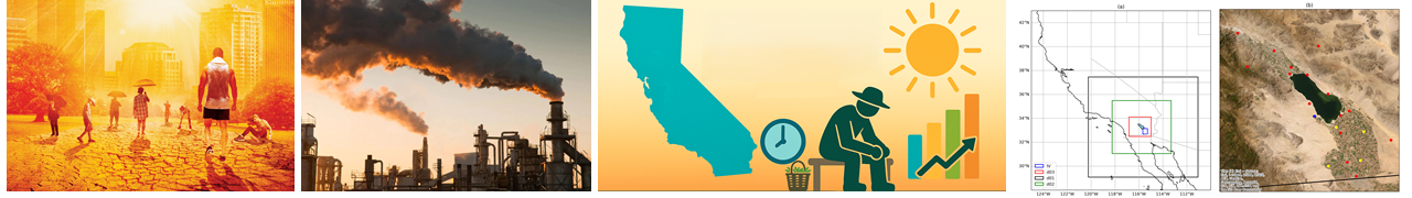
Satellite data have greatly contributed in improving our understanding of Earth’s climate. We have several climate models but, without satellite data, we don’t know how they are performing. Without the satellite data, we don’t know how far is our imagination from reality. Satellite data provide us the realistic boundary conditions. Without the boundaries, our theory may easily turn into a fiction.
Several satellites fly above us everyday. They are watching us. They are recording our behavior. They are indeed CCTV in large scale. They are recording human activities. We have done many things unconsciously in the past. We have emitted environmental pollutants. We have polluted ocean and water bodies. We have cut down trees. But now it is all documented. If you emit pollution or exploit natural resource, you may have to appear in the court one day.
A lot of data has been generated by various satellites. There is a lot of data. Tremendous amount of data. But, unfortunately, only a fraction of this data has been really used, for some useful purpose.
Take an example of surface reflectance data which are available from MODIS and other satellites. Reflectance basically measures how the surface properties change over time. In fact, Earth’s surface records a lot of things, much more things than what you think right now. When it rains, it gets recorded. When the surface gets dried, it is recorded. When it is very cold, it is recorded. When it is very hot, it is recorded. When a hurricane happens, it is of course recorded. When there is flooding, it is indeed recorded. When an asteroid falls, why would it not record it? Deforestation is surely recorded. Even information about day, night, and Earth’s rotation all are recorded. What is not recorded? Everything. Just everything. In a single reflectance data, you will find everything you need. You just need to change your perspective. You will see a lot of information hiding in the data set.
It is only because of our poor creativity that we are sending satellites one after another. Otherwise, we can extract myriad of useful information that we need just from a single data set. We just need some skill to decode that information. We just need a creatively advanced algorithm to extract the required signal from the data. We will benefit more from our satellite data if we spend more time developing algorithms that can extract the various useful signals in a data set.
The possibilities of using satellite data are endless. We just need to be creative. Do not search in Google Scholar for what others have already done with the data. If you do so, you will only reproduce what others have already done. Ask yourself. How can you use the data to manifest your inner passion? Think differently. Creativity will emerge, from within you.
Who said that vegetation data can’t be used to study the fires? We just need to understand the connection. Creativity is within us. To be creative, we have to believe in our own capacity first. The only difference between we and Einstein is that Einstein believed in himself but we didn’t. The exact same intelligence resides within each of us. It is only a question of how much we allow it to come out. To the one who believes in himself/herself, possibilities are endless.
In an earlier post, I talked about how to download MODIS data in NetCDF format. Now I will tell you how to process the downloaded data in MATLAB.
Note that there can be be data outages on certain days so you might see less data than expected. For example, MODIS Aqua data for the year 2008 will have only 364 days of data although 366 (2008 is a leap year) is expected. Check the day stamp in the file name to know exactly which day is missing. I will be processing the 2008 data below. Further, I have noticed that on certain days (2-3 days in a year), the filenames are extra long with some added information during data processing in Giovanni. If you see such unusual names, you have to manually rename the files to make the names consistent with other files.
Read data
Copy all the files in your MATLAB workspace.
Since there are so many daily files, we need to read all the files using a loop. So follow the following steps:
file_names = dir ('*.nc'); % extract filenames and associated information
num_files = length(file_names); %num_files in this case is 364

deep_aod = zeros (360, 180, num_files); % 180 and 360 are latitude and longitude grids in each MODIS data
for m = 1:num_files;
deep_aod (:, :, m) = ncread(file_names(m).name, 'Deep_Blue_Aerosol_Optical_Depth_550_Land_Mean');
end;
The above code will create a 3-d workspace variable named deep_aod (360*180*364) in which 360, 180, and 364 represents longitude, latitude, and days of year 2008, respectively.
Calculate average for plotting
% change the dimensions of latitude and longitude to make it more intuitive (we want to see latitude in the rows and longitudes in the columns)

deep_aod_arng = permute(deep_aod, [2 1 3]);

%bring the time dimension to the front for easier processing
deep_aod_arng_time = permute(deep_aod_arng, [3 1 2]);

% convert the 3-d data to 2-d data so that we can apply vector operations in MATLAB, the resulting rows represent each day and columns represent each grid points in the entire globe.
deep_aod_arng_points = reshape(deep_aod_arng_time, [364 64800]);

Upon examining the data files we see that the days 107 and 309 days are missing. So lets insert two arrays in the respective place so that the date represents complete year and it is easier for further processing.

%create a dummy row of NaN to be inserted

dummy = NaN (1, 64800);

%insert the dummy row at the respective rows

deep_aod_arng_points_complete = [deep_aod_arng_points (1:106, :);dummy;deep_aod_arng_points (107:308, :);dummy;deep_aod_arng_points (309:end, :)];

Now create a timetable using this data; it will make it very easy for further calculations, for example, for calculating monthly mean.

%first create a datetime array for 2008

t1 = datetime (2008, 01, 01);
t2 = datetime (2008, 12, 31);
t = (t1:days:t2)';

% now create the timetable

deep_aod_2008_timetable = timetable(t, deep_aod_arng_points_complete);

%now lets calculate the monthly mean AOD values using this timetable

aod_monmean_2008 = retime (deep_aod_2008_timetable, 'monthly', 'mean'); %
Plot the data
% To plot the data, we need to read the latitude and longitude data from any one MODIS file:
MYD_lat = ncread('MYD08_D3.A2008001.061.2018031095350.hdf.nc', 'YDim');
MYD_lon = ncread('MYD08_D3.A2008001.061.2018031095350.hdf.nc', 'XDim');
% create a 2-d grid of latitude and longitude to be used for plotting
lat_mat = repmat(MYD_lat, 1, 360);
lon_mat = repmat(MYD_lon', 180, 1);
Now plot data with the below script using geoshow.
h1 = figure('position', [50 50 1200 600]);
axesm mercator
p = worldmap([-90 90],[-180 180]);
%borders('countries', 'Color', 'black', 'linewidth', 0.75)
gridm('on');
setm (p, 'mlabellocation', 40); % for reference_longitude
setm (p, 'plabellocation', 20); % for reference_latitude
geoshow('landareas.shp', 'linewidth', 1.2, 'facecolor', 'none')
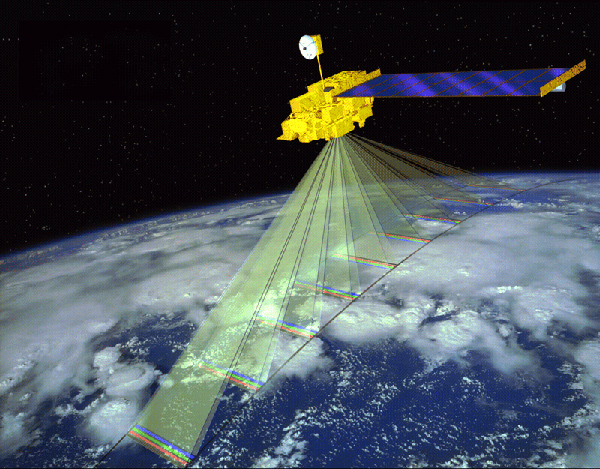
h2 = geoshow (lat_mat, lon_mat, reshape(aod_monmean_2008.deep_aod_arng_points_complete(1, :), [180 360]), 'displaytype', 'surface');
caxis([0, 1]);
title('MODIS AOD Jan 2008');
colormap jet; brighten(0.5);
h3 = colorbar;
set(h3,'fontsize', 12);
You should get a plot like below:
Note: always verify the accuracy of the plotted data from your intuition or secondary sources. For example, in this case, I know that bodele in central Africa is one of the most active dust source region so it should have high AOD which I can see in this plot.